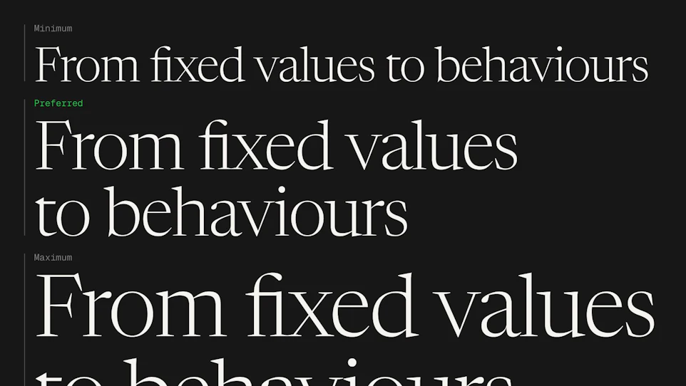



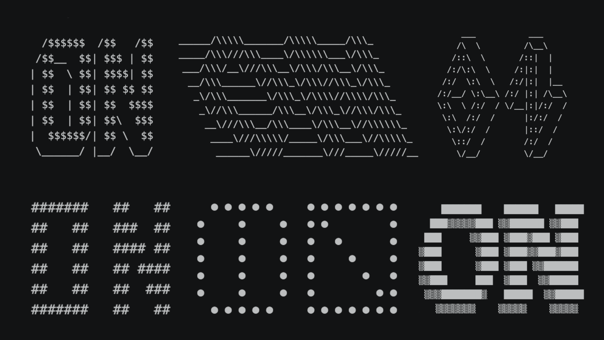

Creative Spark is our in-house R&D session: ninety minutes, a single theme, and a room full of people building prototypes with no client to please and nothing due at the end. This time the theme was type in motion. We wanted type to feel less like a fixed shape that carries information one way and more like a material with some give in it. But the afternoon turned out to be about something bigger than typography: how cheap and fast exploring an idea has become, and what that does to the way a studio spends its time.
What we questioned
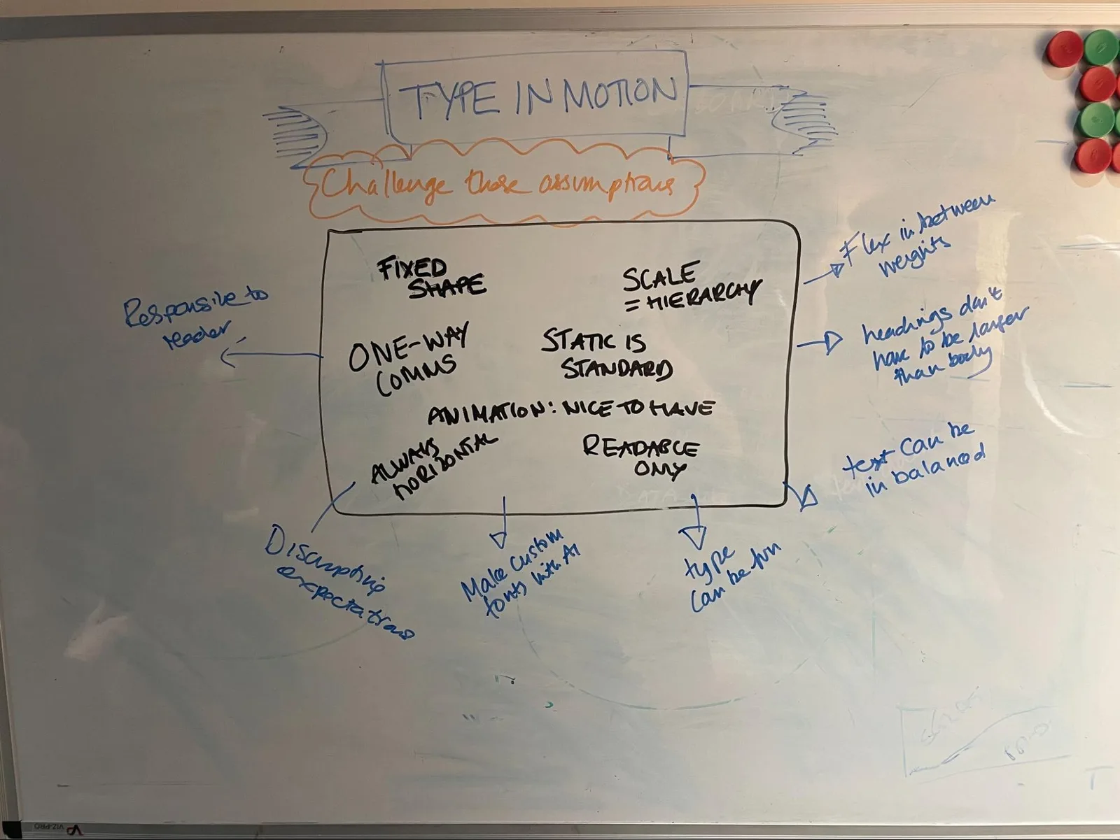
A few of our assumptions went early. Weight can change mid-word. A heading needn’t be the biggest thing on the page. Motion has to do a job rather than decorate, without sliding back into the hyperactive web of 2002. Most of these aren’t rules anyone chose on purpose; they’re hangovers from how web type is built, all CSS axes and classes, and that machinery sands the creativity out of it. The tooling has moved on, though. The new AI font editors make a bespoke cut of a typeface cheap enough to try on a whim, so the cost of asking “what if the type did this?” has more or less collapsed.
What we made
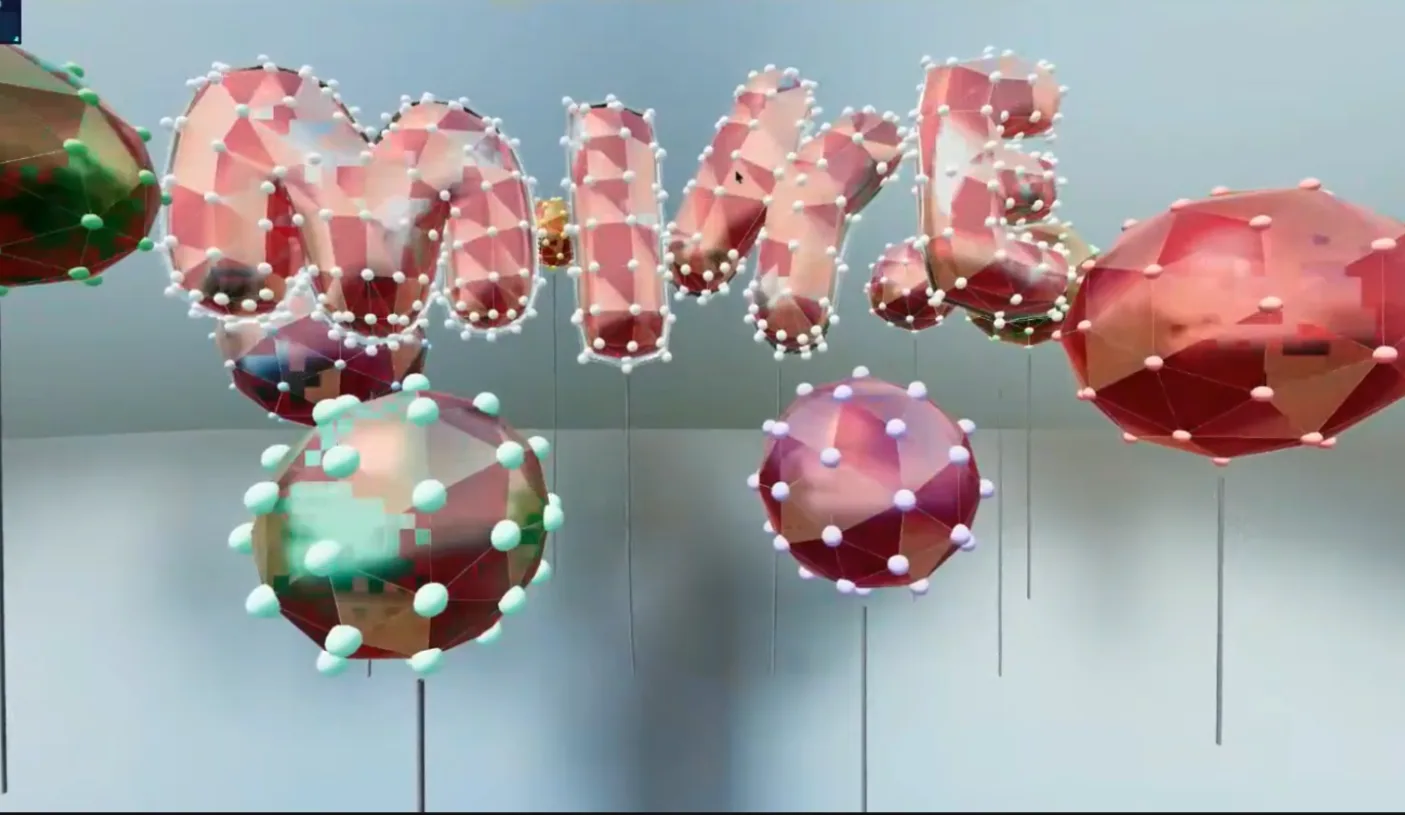
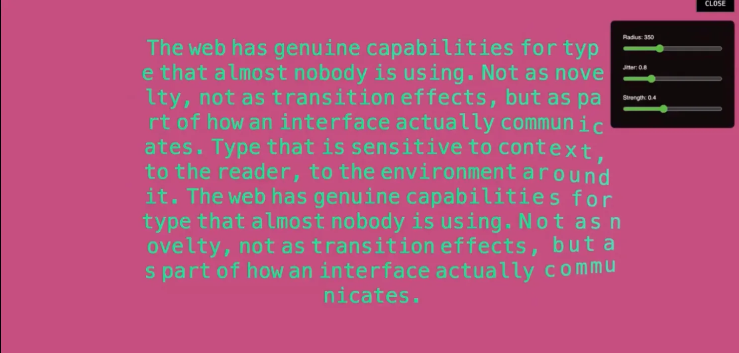
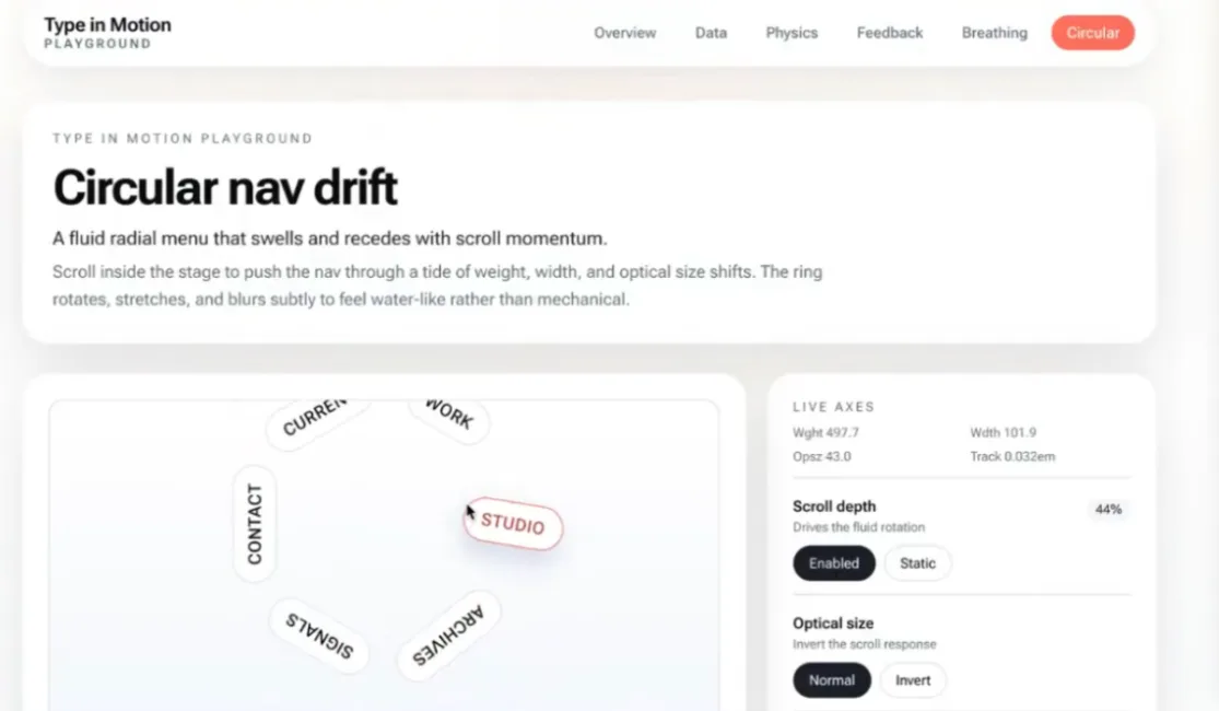
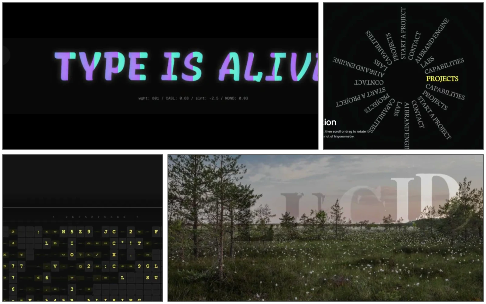
Six prototypes came out of it, all over the map. One was a 3D dial you turn instead of scrolling a list. Another tied typography to scroll speed, so the text frays the faster you go. A few used the camera, with hand and face tracking that shoves the letters around — very Minority Report. There were soft-body letters that behave like balloons, bouncing on gravity and anti-gravity. Someone rebuilt the dial from scratch in plain JavaScript and CSS in about ten minutes, from a JSON spec and a reference URL, just to see how close standard web tech could get. None of them were precious, and that was the idea: enough range, fast enough, that binning most of it still leaves you ahead.
What we took away
The making turned out to be the cheap part. We settled on a cheap, fast model to churn out the bulk and a slower, pricier one to tidy up after it; the whole multi-model run came to about £1.40. For the price of a coffee we had a spread of directions that would normally take days to work up. When making the thing is nearly free, the hard part isn’t the making any more — it’s knowing which of the six is worth pursuing, and why.
A couple of things caught us out. You can do proper hand and camera tracking in the browser now with no extra software, which none of us knew. And the move off loose “vibe coding” onto structured prompts and JSON build specs mattered more than any clever wording. The boundaries kept the models from wandering and handed back code we could actually use.
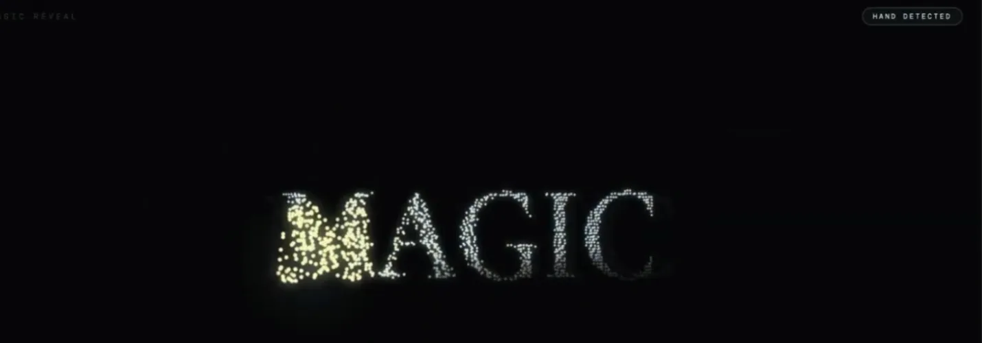
The speed stuck with me most. We started with a vague theme and, ninety minutes later, had a handful of working, clickable prototypes. That’s the kind of session I’d put a client in the room for: not to show them finished work, but to let them watch an idea become six things they can click before lunch.
Magic and logic
There’s a split underneath all of this. The balloon letters showed it. Motion looks right when it obeys physics — mass, gravity, the way a soft body overshoots and settles. That’s the logic. A model holds it without effort: the easing curves, the equations, the maths of how things move. You can hand all of that over. None of it has to live in your head.
What’s left is the magic, and the magic is taste. Should the letter bounce at all? Is this the moment for it? A model can make motion look natural. It can’t tell you it’s good. I don’t think that part can be written down. Make a list of everything we like and it’s out of date before you finish. Taste keeps moving. That’s the part no model took off us.
These models are really just a store of human memory. Fallible, unpredictable, sometimes astonishing. But it’s more personal than that. What comes back is shaped by you — your words, your tone, the way you ask. No two conversations are the same.
We hand over the logic and keep the magic. Maybe that’s what these tools are really for: they show us what’s human in us. Not a record of where we’ve been. The taste for where to go next.